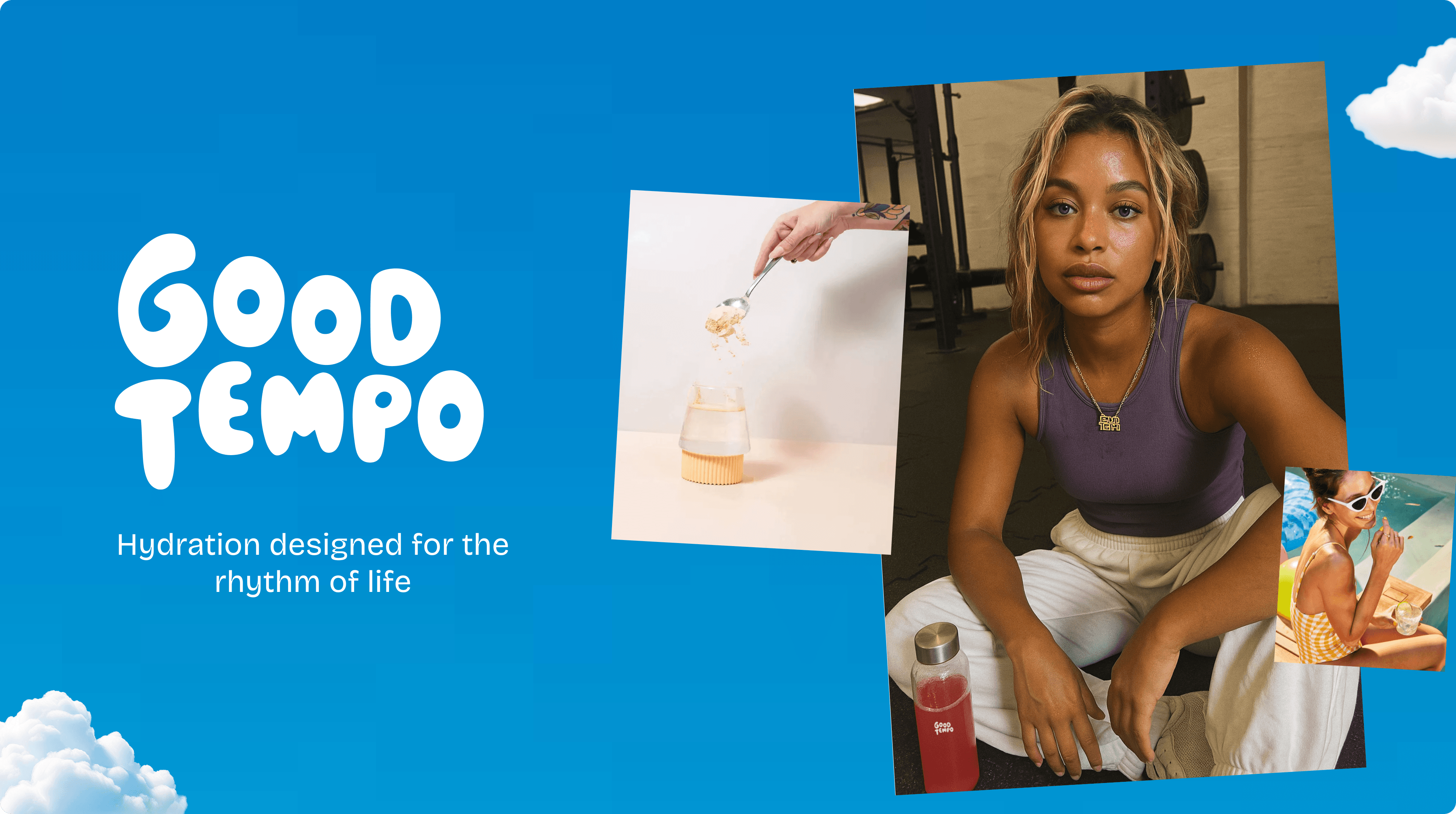
Good Tempo
Building a wellness brand from scratch
Context
Most hydration brands fall into two camps.
Clinical and cold, or soft and vague.
We wanted something different.
Good Tempo is a hydration supplement built around a simple idea:
help people find their rhythm and perform at their best, without the usual noise.
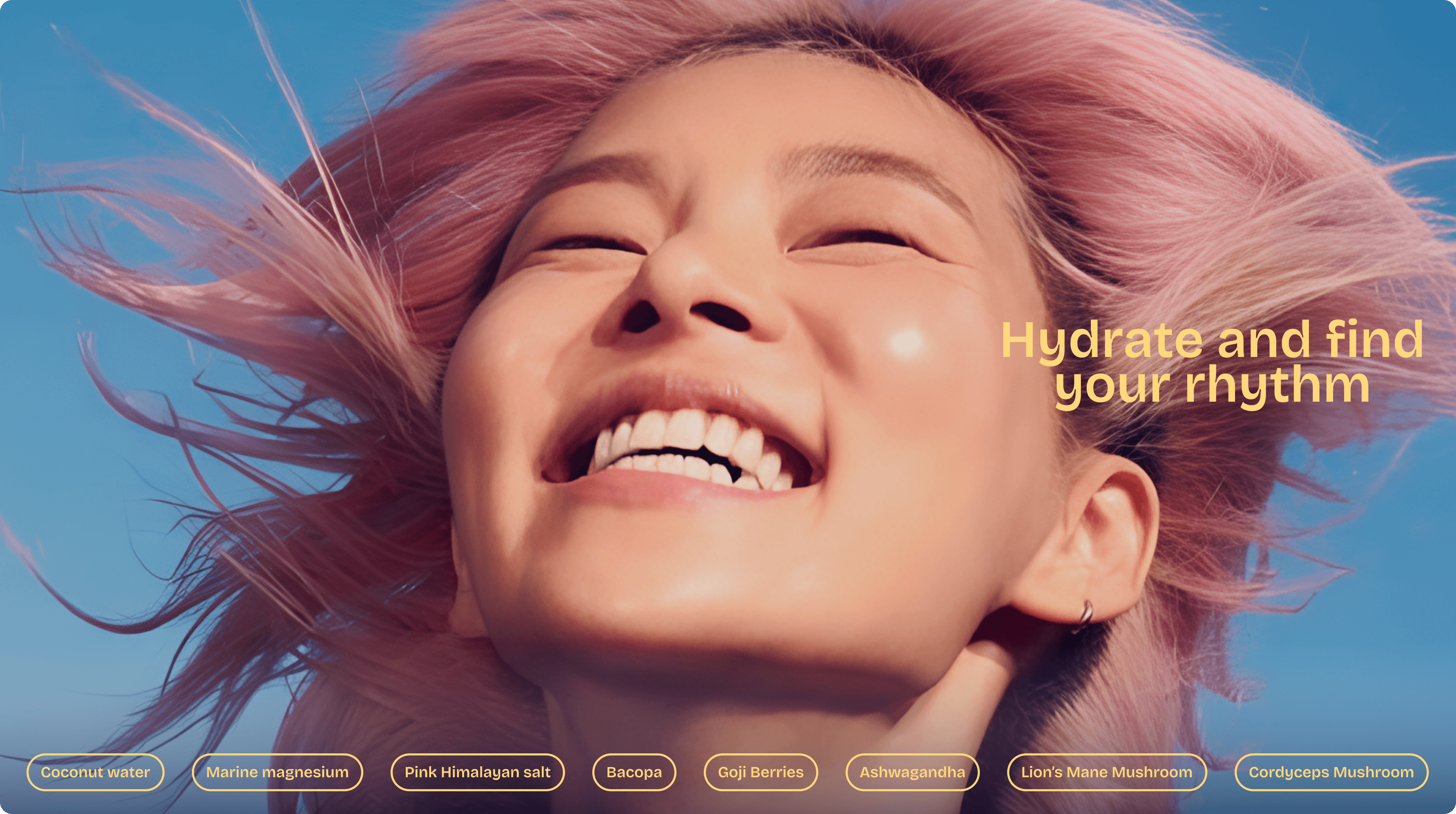
The work
I was a founding designer on the brand.
I shaped:
the positioning
the identity
the visual system
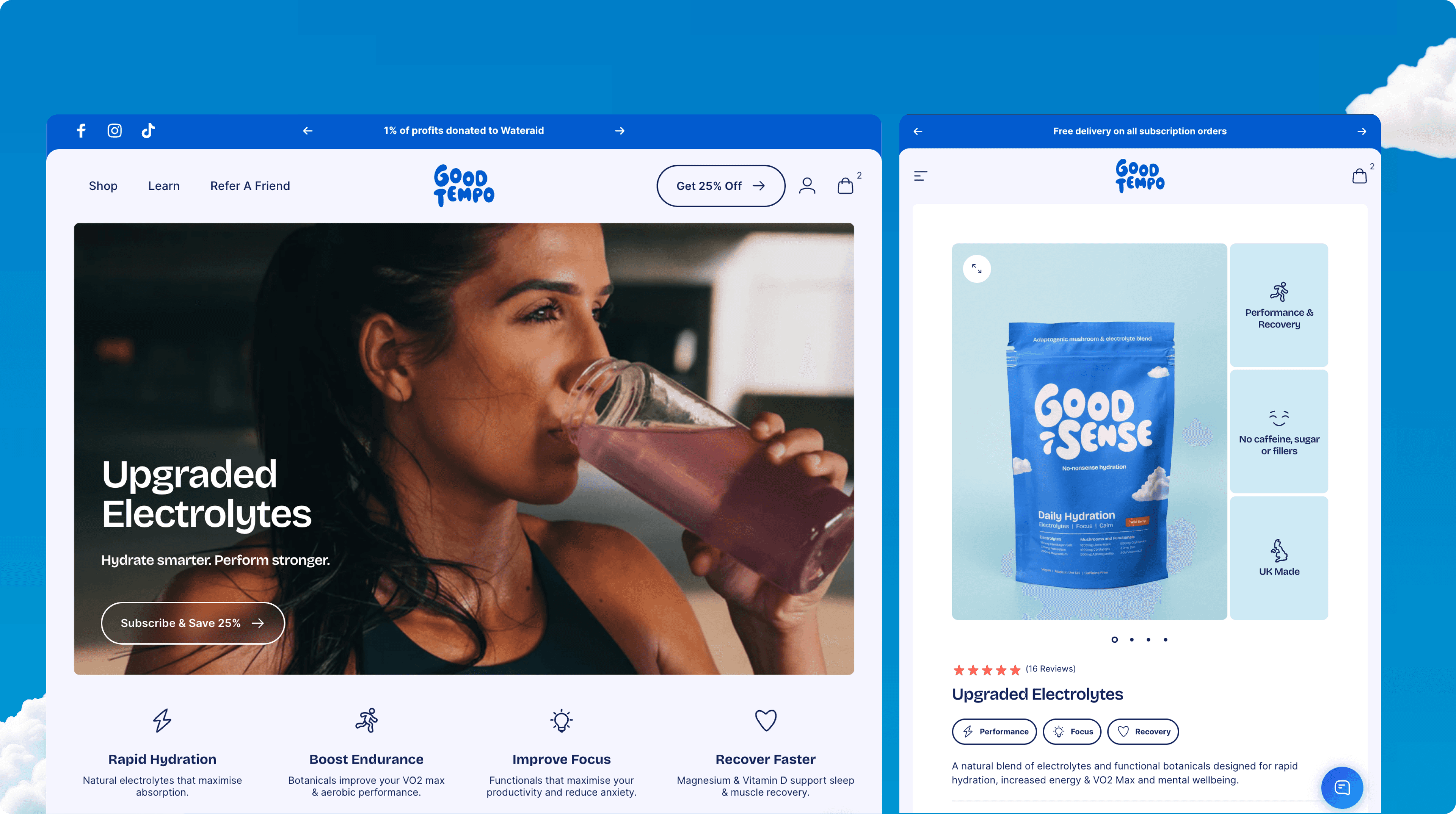
early web and product expression
This was not just about how it looked.
It was about what the brand stood for, and how that showed up everywhere.
Approach
The key tension was clear:
energetic, but calm
bold, but credible
I designed the identity around rhythm.
A logotype with movement and bounce
A colour system that balances energy with trust
Typography that feels confident but grounded
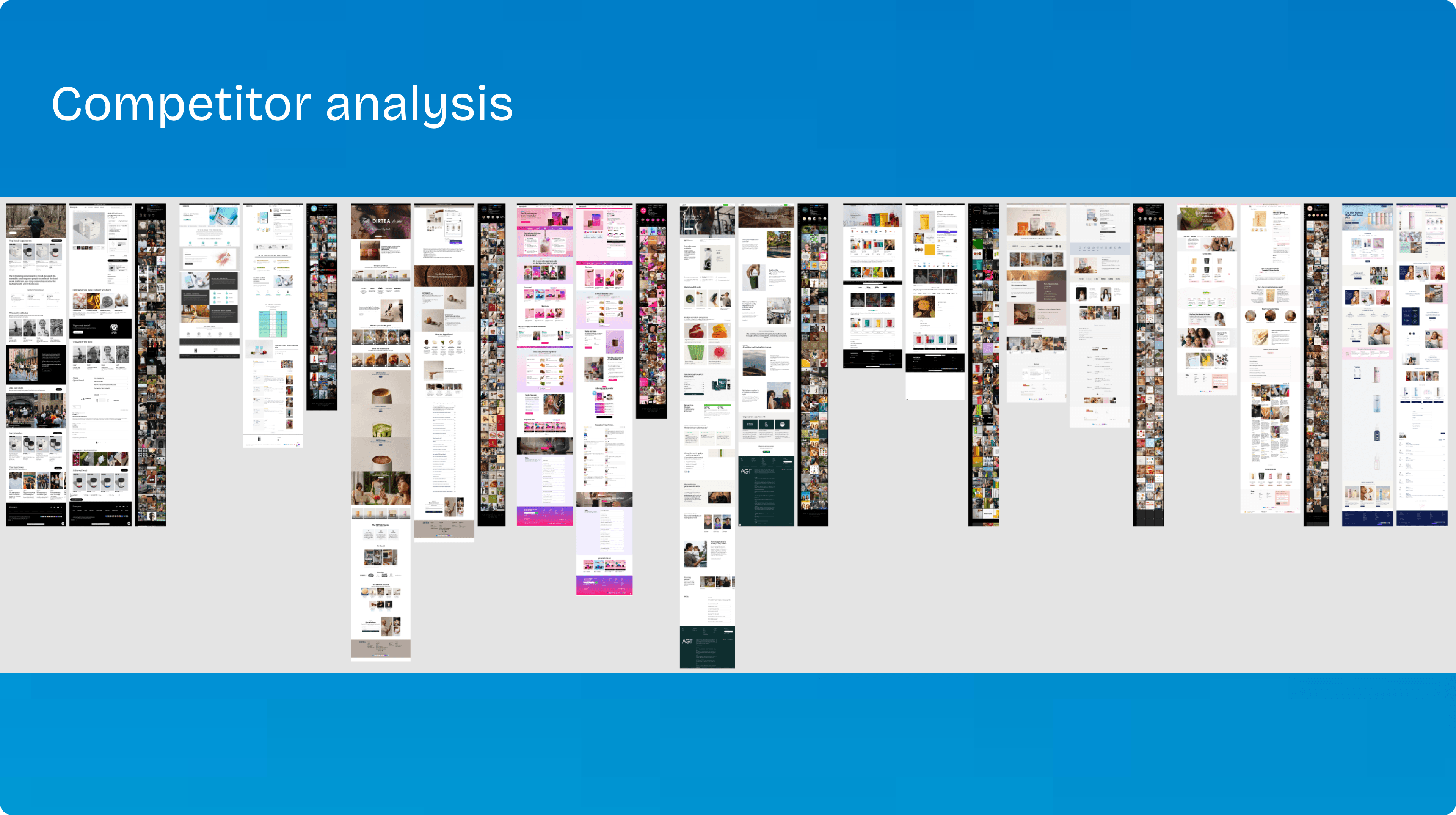
We explored multiple directions and tested them before landing on something that felt both distinctive and usable.
Outcome
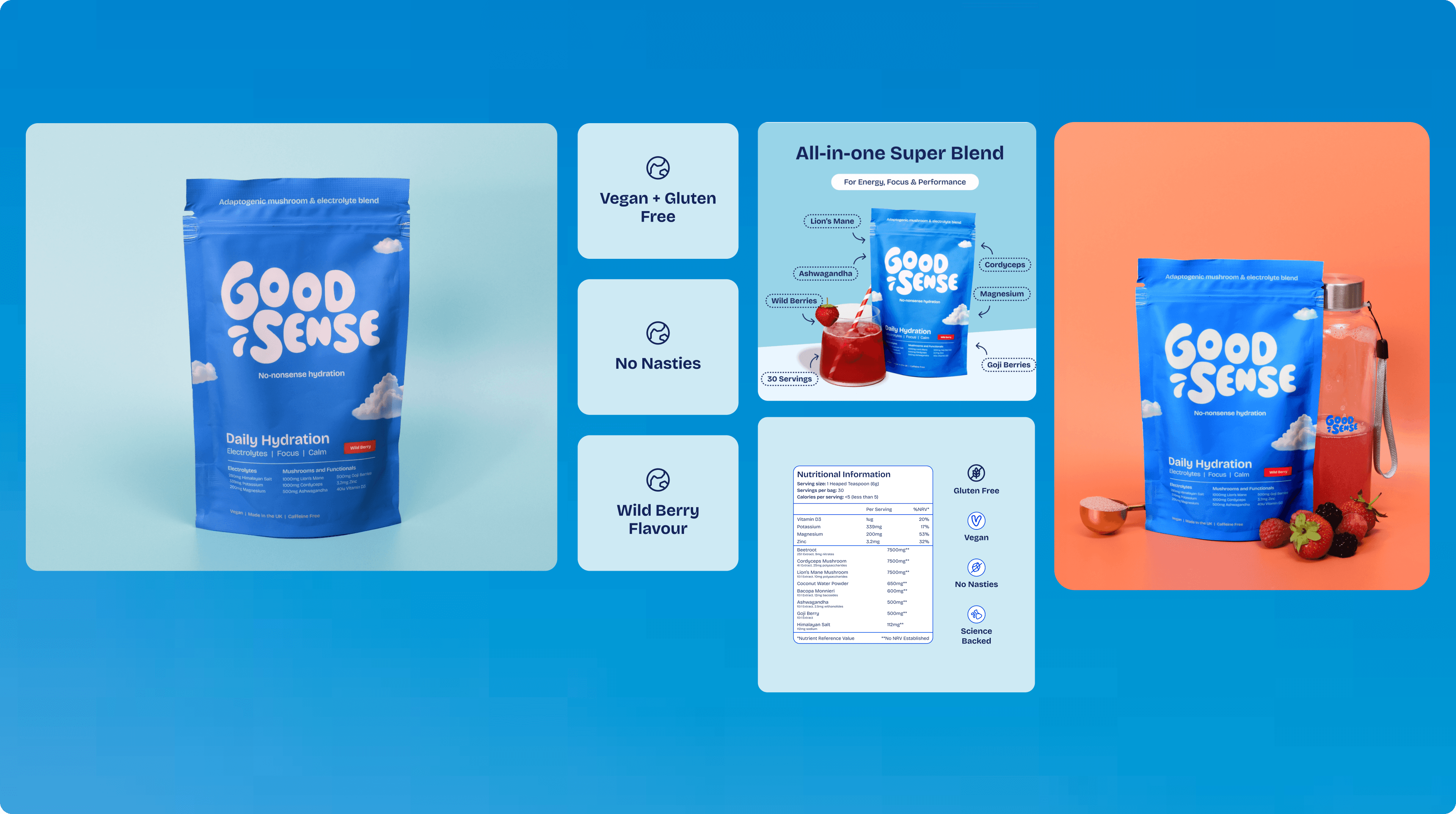
A brand that stands apart from typical wellness products
A clear visual and verbal system across web, packaging, and content
A foundation strong enough to scale
Reflection
This was about more than branding.
It was about building something people could recognise, trust, and come back to, without over-claiming or over-designing.